virgin wines project
virgin wines project
Reuse, Restore,
Redesign,
Joy not just,
in a bottle.
Joy not just
in a bottle.
Overview & brief:
For this collaborative project we were tasked with redesigning Virgin Wines’ 'Checkout', 'Wine Tastings' and 'About' pages for both mobile and desktop devices.
Our goal was to capture the 'Joy' through the fresh and bold rebranding by Borne whilst echoing the 'natural flow' of Virgin Wines.
As Lead UX/UI Designer, I managed group tasks and guided the design direction, ensuring consistency and usability.
services
LEAD DESIGNER
UX/ UI User Testing Design Research Wireframes Prototyping
MOBILE
DESKTOP
timelinE
apr '24 - may '24
(6 weeks)

competitior research:
Research
competitior research:
Research
findings
findings
As a team, we conducted extensive research to uncover UX issues and opportunities. Leading the process, Leading the process, I created a structured Miro board with eight categories to organise our findings.
The affinity map highlights problems and solutions from a Q&A with the Virgin Wines team, guiding our targeted design improvements.
VIRGIN WINES PROJECT:
introducing
the brand
VIRGIN WINES PROJECT:
introducing
the brand
Joy not just in a bottle.
planning:
Initial Sketches
planning:
Initial Sketches
This section showcases our group’s early design process, where we sketched ideas inspired by research, competitors, and Virgin Wines’ brand guidelines.
We focused on standing out while staying industry-relevant, highlighting the ‘joy’ font for its visual and brand impact. Additionally, we drew plans to introduce a navigation bar to 'Live Events', reflecting an improved, concise and direct user flow.


Brand identity:
Designing
with purpose
As part of the brief, we integrated Virgin Wines’ recent rebrand by Borne into our UI designs. We used their new brand assets, including the 'Joy' typeface and colour palette to establish a consistent design flow.
This alignment with the brand’s “natural flow” sentiment helped us create a visually cohesive and on-brand user experience.
Developing prototypes:
Start shaping
Developing prototypes:
Start shaping
Creating three Figma sandboxes we explored a wide range of prototypes for the About Us, Live Events, and Checkout user flows, allowing us to experiment with layout, branding, and usability.
Creating three Figma sandboxes we explored a wide range of prototypes for the About Us, Live Events, and Checkout user flows, allowing us to experiment with layout, branding, and usability.
Creating three Figma sandboxes we explored a wide range of prototypes for the About Us, Live Events, and Checkout user flows, allowing us to experiment with layout, branding, and usability.


virgin wines project:
prototypes
virgin wines project:
prototypes
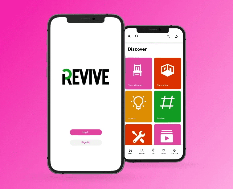
discovering Virgin Wines:
About Us
discovering Virgin Wines:
About Us
The redesigned About Us page offers a clear and engaging way to connect with the Virgin Wines brand:
Brand Story First: The content focuses on Virgin Wines’ mission, values, and team, building trust and giving users a personal insight into the brand.
Bold Typography: The ‘Joy’ typeface brings energy and personality to the page, reflecting the brand’s tone and enhancing key messages.
Structured Design: Clean sections, strong visuals, and a clear hierarchy makes the content easier for the user to digest, whilst delivering a smooth and engaging user experience.
Rich Content Focus: Key sections highlight Virgin Wines’ values, winemaking team, achievements, and social impact, creating a strong emotional and brand connection with users.
How might we create a streamline experience where users can browse, shop and discover?
How might we create a streamline experience where users can browse, shop and discover?

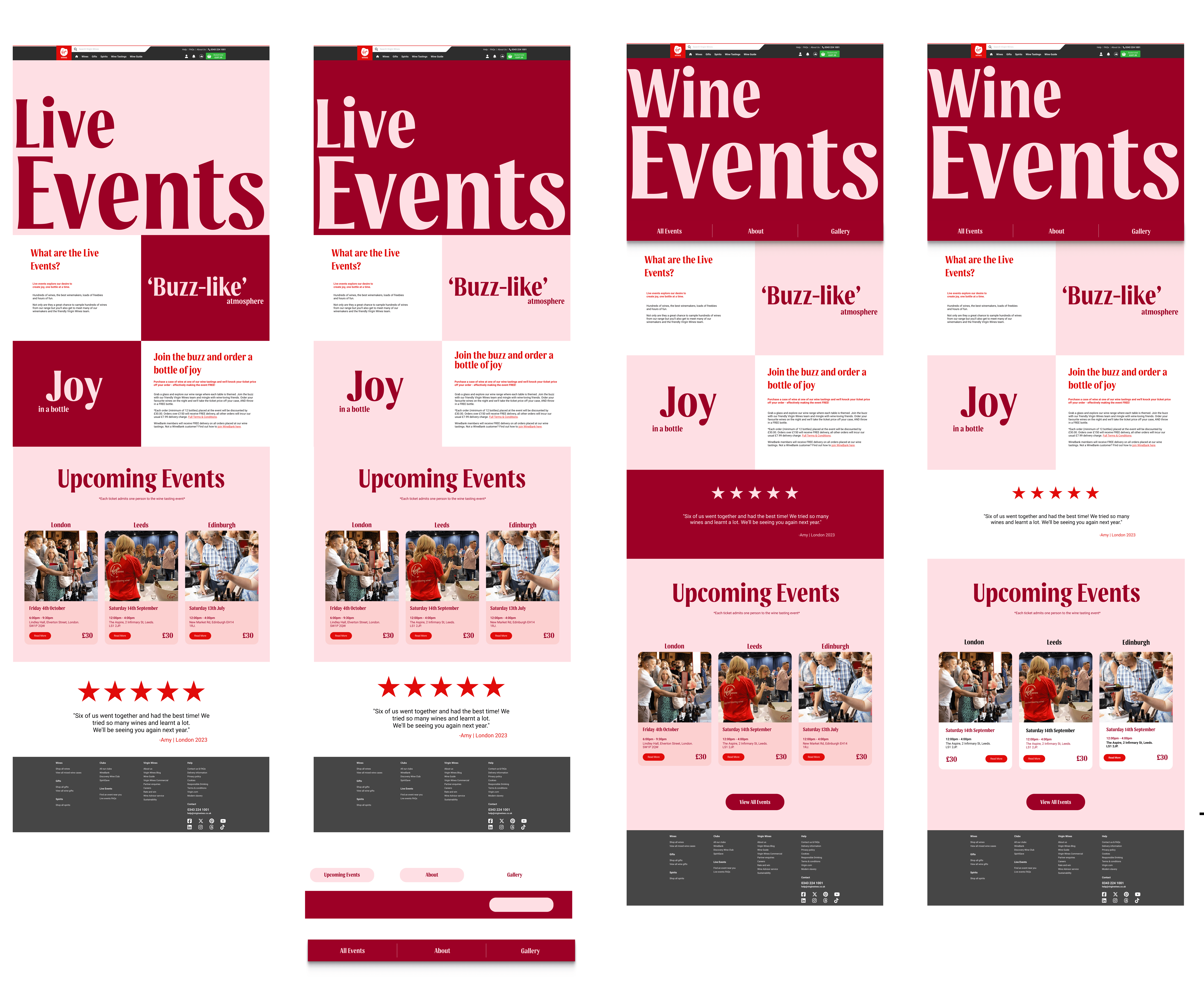
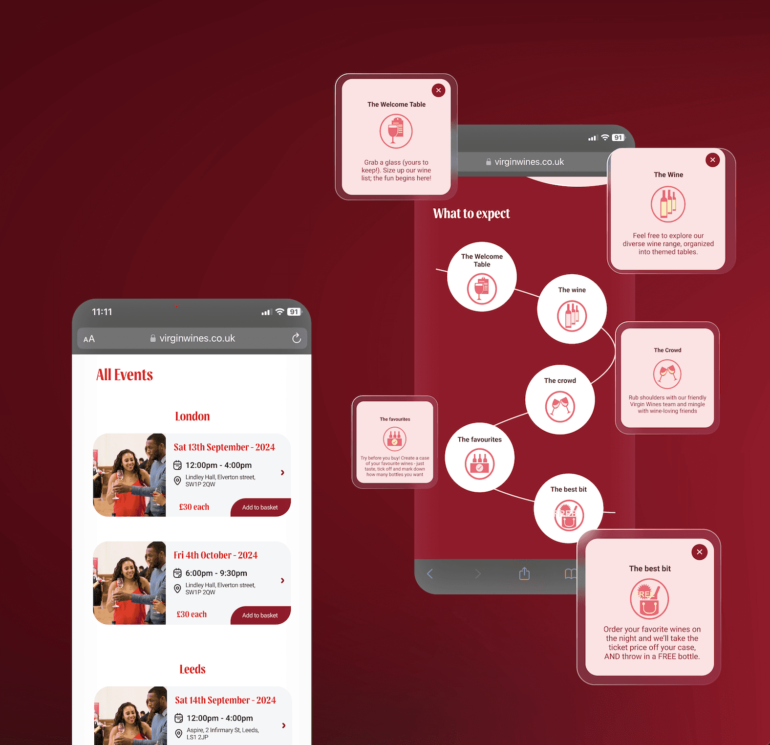
Wine Tasting with Virgin Wines:
Wine Events
Wine Tasting with Virgin Wines:
Wine Events
As a group we renamed “Live Events” to 'Wine Events', clarifying the offer, while the design delivers clarity, community, and a premium tone.
Seamless Navigation: A mini navigation bar separates content and supports intuitive user journeys across the section.
Upcoming Events: Events from a range of cities have dedicated pages with date, venue, ticket details, and event highlights.
Shopping with Confidence: User reviews, FAQs, and clear pricing build trust, while ‘What to Expect’ sections and maps showcasing the venues help users feel confident before booking.
Visual Consistency: Bold typography, vibrant photography, and warm colour blocks capture the 'sheer excellence' of the tasting experience.
As a group we renamed “Live Events” to 'Wine Events', clarifying the offer, while the design delivers clarity, community, and a premium tone.
Seamless Navigation: A mini navigation bar separates content and supports intuitive user journeys across the section.
Upcoming Events: Events from a range of cities have dedicated pages with date, venue, ticket details, and event highlights.
Shopping with Confidence: User reviews, FAQs, and clear pricing build trust, while ‘What to Expect’ sections and maps showcasing the venues help users feel confident before booking.
Visual Consistency: Bold typography, vibrant photography, and warm colour blocks capture the 'Sheer Excellence' of the tasting experience.
Checkout made easy, with 3 simple steps
A user experience with a 'natural flow':
Checkout
A user experience with a 'natural flow':
Checkout
A user experience with a 'natural flow':
Checkout
Displayed through 3 simple steps; 'Shipping, Payment, and Review & Pay' and guided by a progress bar for clarity and ease.
Flexible Access: Users can log in, register, or check out as a guest, reducing friction for first-timers.
Clear Delivery Options: Pricing and timing are shown early, helping users make informed decisions.
Multiple Payment Methods: Supports Google Pay, PayPal, and card for quick, seamless checkout.
Branded Confirmation: A clear summary and playful message (“A drop dropped off”) reinforce a satisfying finish.
virgin wines projects:
final overview
virgin wines projects:
final overview

key takeaway:
Future
key takeaway:
Future
strategies
strategies
As the Lead UX/UI Designer on this project, I focused on improving content clarity, navigation flow, and user trust across the Wine Events experience. We also applied key techniques such as user flow mapping, content hierarchy and tone of voice refinement.
This project offered valuable UX insights, showing that small, strategic changes like renaming content, introducing mini navigation, and clarifying event details, can significantly enhance user engagement.
Designing for real-world experiences reinforced the importance of structure, language, and accessibility in shaping intuitive journeys, in aims to illustrate a 'natural flow' for Virgin Wines.